Making Images Look Great At Any Size With React And Amplience
You have a vague memory of being a one year old. You’re crawling around in some playpen, and you see a square-shaped toy that looks like at least a few minutes of fun. Upon reaching it, you notice something positioned next to the square. It’s a tiny table, with holes of various shapes in the top. “There are no coincidences”, you think to yourself, “this square toy must go in one of these holes”. But this table wasn’t made for your square. The holes are not the same shape. You try to cram the square through the circle over and over, but to no avail. You muster all of your remaining strength and try forcing your square through the triangle as well, but it just won’t fit. Tired and frustrated, you fall back on your diaper, and begin to cry until you fall asleep.
If you’re a Web Developer or Software Engineer, you may have had similar experiences while trying to manage digital assets for a responsive website. Curating multiple versions of the same picture, across several different breakpoints, can often feel like trying to square the circle. Design spends extra time creating more images. Developers spend extra time implementing various versions. And if something doesn’t work in one of those in-between breakpoints? Lots of hacking. Yuck!
Recently, we came across a solution to handling responsive images that avoids all of the messiness of dealing with multiple assets, by leveraging React.js and Amplience. Amplience is an e-commerce oriented headless CMS that comes with lots of cutting-edge features out of the box, and React is everyones’ favorite* (Not hyperbole) Front-End javascript framework.
Here’s how it works. Amplience has a feature called Point Of Interest (POI) inside of their asset management interface, which lets content administrators label certain parts of an image as “important”. This is really cool, because it allows Amplience to automagically crop and resize images at different sizes based on what parts of the image you think are most important. Below is a preview of how the POI asset management interface looks (the point of interest is a draggable square with a circle inside).
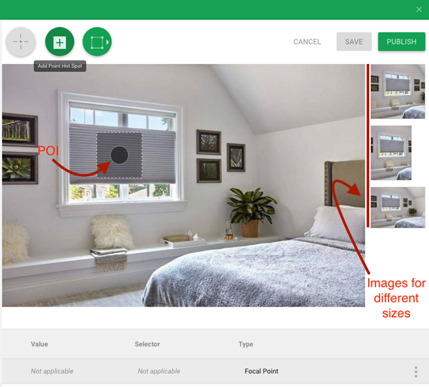
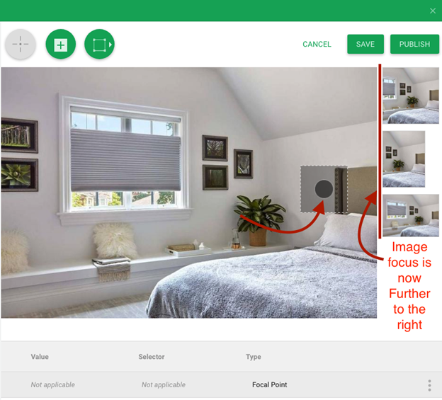
As you can see, Amplience gives you a preview on the right side of how your image will look in different aspect ratios. If you were to move that POI dot, you could see in real time how the images in the right hand panel would change.
Once you choose a POI for the image and save it, it’s ready to be consumed by your front end.
To utilize the POI features from your Front-End, all you’ve got to do is send a few url parameters along with your normal request for the image. These parameters, when compiled together into a url, will look roughly like this (color red added to placeholder names, color purple added to parameter names).
https://youramplienceimageserver/imagefilename?&w=1901&h=1070&scaleFit=poi&poi={$this.metadata.pointOfInterest.x},{$this.metadata.pointOfInterest.y},{$this.metadata.pointOfInterest.w},{$this.metadata.pointOfInterest.h}
Holy cow! That’s a lot of parameter goodness to take in at once, so let’s go in and break that down.
- The ‘youramplienceimageserver’ part will be specific to whatever your particular amplience image server is, and the ‘imagefilename’ section will be particular to whatever your particular file’s name is. Same as any standard image call.
- The w parameter describes the width of the image you want to get. The h parameter describes the height of the image you want to get. These are the variables you will want to change based on the dimensions of the screen your user is looking at
- scaleFit parameter just tells amplience that we are using the poi feature on this image request
- poi parameter parameter looks like a doozy, but it’s really just a string you can attach to the end of the url to tell Amplience “hey, when you are grabbing an image of w x h dimensions, pretend it’s a 2d Cartesian plane, and make sure to execute your scaling magic around the point of interest that has an x and y coordinate of wherever we positioned our crosshair (see images above)
Now that we know what url to construct, all that’s really left to do is to decide what width and height parameters to send off our request with. Here’s one way to do that in React:
import React from “react”;
import { useMediaQuery, useTheme } from “@material-ui/core”;
const MyComponent = ({ imageDataFromAmplienceCMS }) => {
// When a user goes through Amplience to select an image for their page, and the Front-End fetches the image data for that page
// the image will be returned to the Front-End from Amplience with the following structure
// imageDataFromAmplienceCMS example = {
// defaultHost: “cdn.media.amplience.net”,
// endpoint: “nameofyourhostedamplienceplatform”,
// id: “fakeidstring-fake-4aa5-8idc-0fake3bd8itb2737”,
// name: “nameofimage”
// }
// For simplicity sake, we’re using Material-UI here to keep track of what breakpoint users are at, though you might use some other method in your code
const theme = useTheme();
const smAndDown = useMediaQuery(theme.breakpoints.down(“sm”));
// you can use some similar funciton to construct your url
const assembleUrl = (defaultHost, endpoint, name, width, height) => {
return https://${defaultHost}/i/${endpoint}/${name}?&w=${width}&h=${height}&scaleFit=poi&poi={$this.metadata.pointOfInterest.x},{$this.metadata.pointOfInterest.y},{$this.metadata.pointOfInterest.w},{$this.metadata.pointOfInterest.h};
};
let mobileUrl = assembleUrl(
imageDataFromAmplienceCMS.defaultHost,
imageDataFromAmplienceCMS.endpoint,
imageDataFromAmplienceCMS.name,
width,
height
);
let desktopUrl = assembleUrl(
imageDataFromAmplienceCMS.defaultHost,
imageDataFromAmplienceCMS.endpoint,
imageDataFromAmplienceCMS.name,
width,
height
);
return (
<div>
<img src={smAndDown ? mobileUrl : desktopUrl}
</div>
);
};
export default MyComponent;
And that’s all the magic there is to it! With about 40 lines of code, and a few cutting-edge technologies, we found our own simple solution to a development conundrum that stretches all the way back to the Bronze Age of responsive design.